Generic, templated interfaces
AI tools default to the pattern they have seen most often, which nobody chose for your users, so the screens work but look like every other app built the same way.
UX/UI Design
Human expertiseYour AI-built product works and ships quickly, but users drop off, the interface looks generic, and it is hard to tell whether people are confused or simply not interested. We review every screen, redesign the layouts, flows and details that make an app look AI-generated, and show you which screens are costing you customers.
We use AI on every project because it lets us deliver quickly, but the decisions that make a person stay or leave still call for an experienced designer. These are the problems we see most often in AI-built products.
AI tools default to the pattern they have seen most often, which nobody chose for your users, so the screens work but look like every other app built the same way.
An AI tool generates each screen on its own, so nobody checks how the screens connect or where a person gets lost between them.
Screens come out technically correct but hard to scan, so people can't tell where to look or what to do next.
The main path works, but the first time someone reaches an empty list or a failed payment, the screen offers no explanation and no next step.
Every screen involves hundreds of small decisions about tone, spacing, wording and priority, and an AI tool settles each one on the average of its training data, with no knowledge of your users.
That remaining 20% is design judgment: what a person notices first on a screen, where they hesitate and what makes the product feel finished. AI tools do not make those calls, so we make them for you.
We work through every flow the way a user would and mark where they would hesitate or get lost, so each screen leads clearly to the next step.
We decide what comes first on each screen, what can be removed and how the wording reads to your users, so people know where to look first.
We look for the drop-off nobody has flagged yet, such as the step people repeat, the button they never press, or the message that reads as an error.
We refine these details until the product looks finished, because people rely on them to judge whether a product is safe to trust with their data.
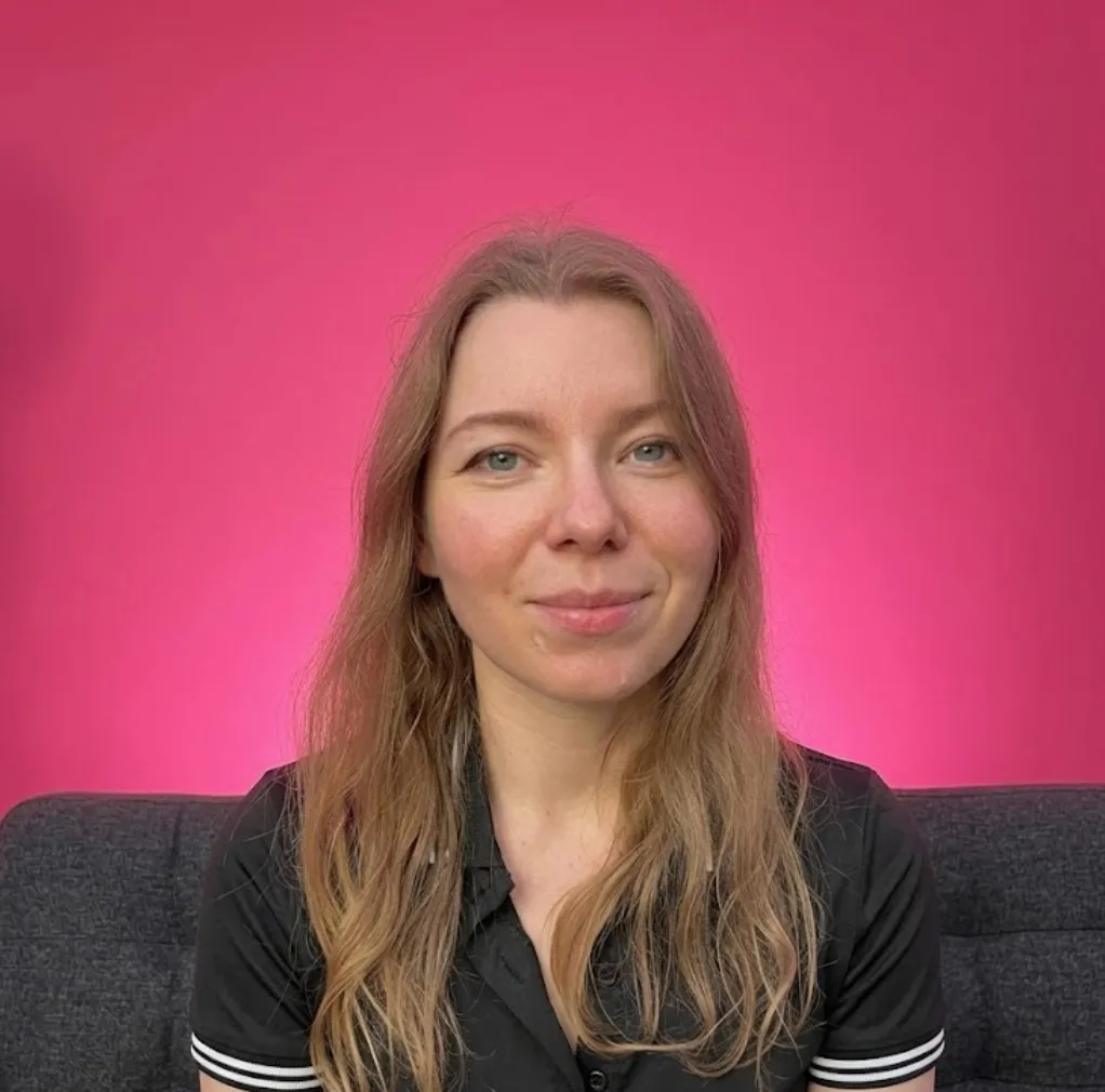
Anna Sholokhova
Senior UX/UI Designer
Anna is a senior UX/UI designer with more than 14 years of experience in product design and product management, and has designed dozens of SaaS, healthcare and smart-home products used by millions of people. At Neo Carbone, she reviews AI-built apps screen by screen and redesigns the flows, layouts and details that make them hard to use, so the product is clear from the first screen and looks finished.
Products that their teams built with Lovable, Cursor and similar tools, then brought to us for a redesign.
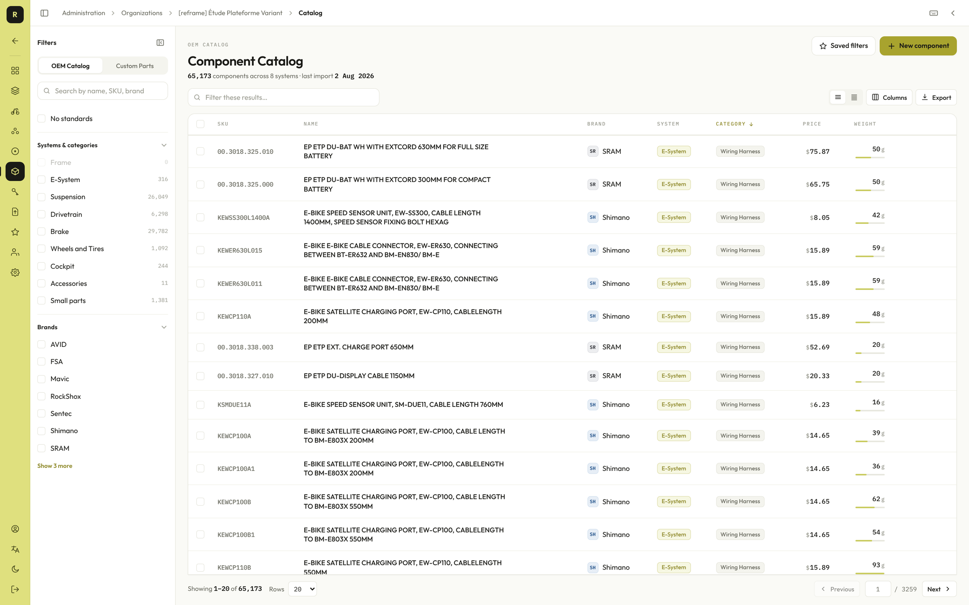
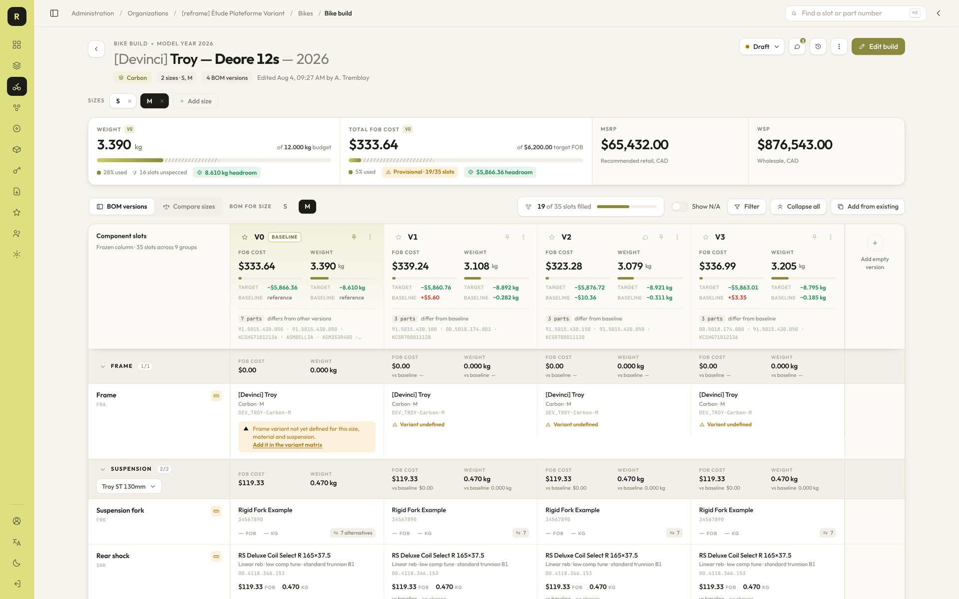
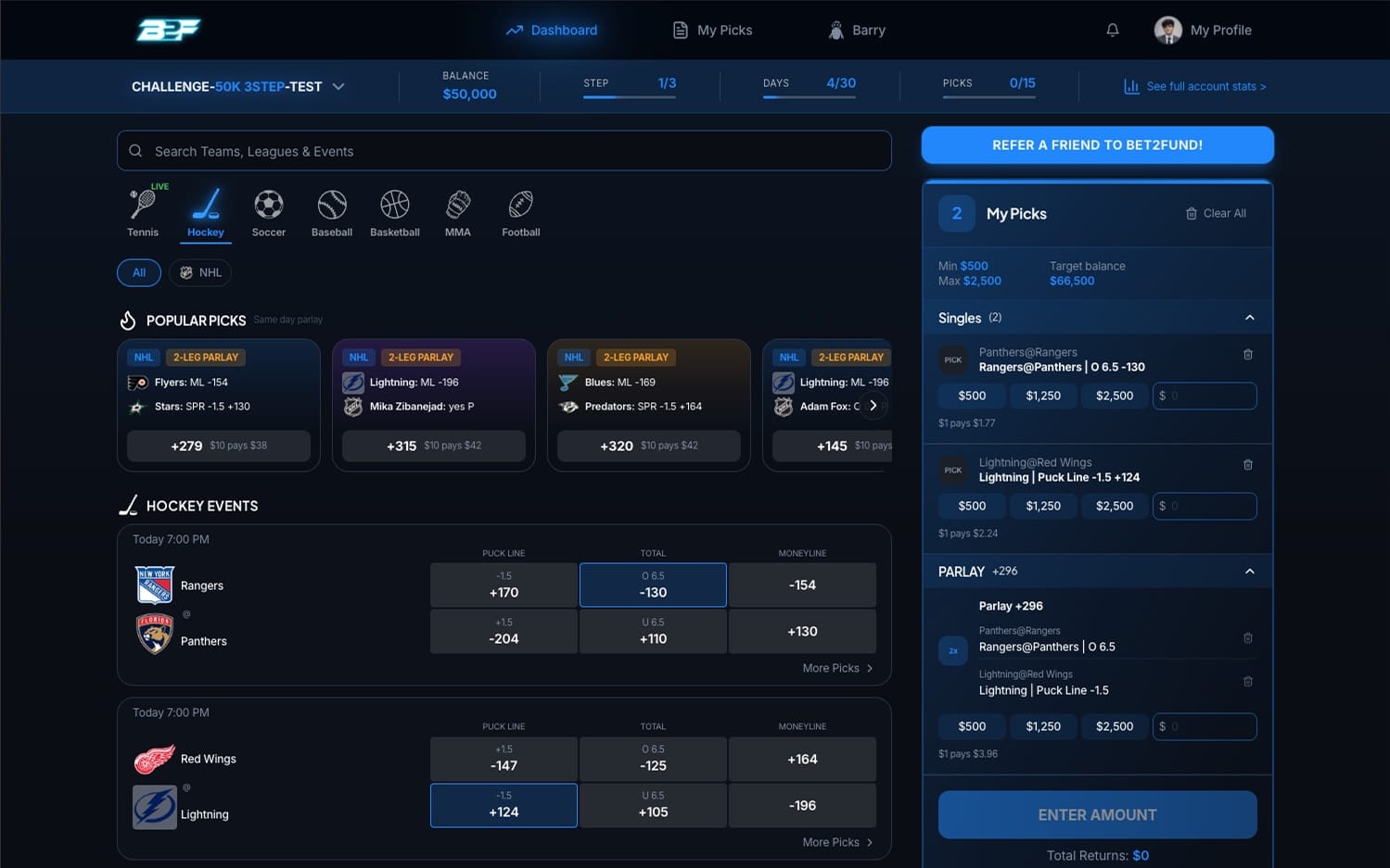
Each service fits a different stage, from a single audit of a live app to an ongoing design partnership while you build.
A free call to discuss your product, your users and where the experience is not working.
We recommend the service that fits your situation and send a proposal with a timeline and a price.
We carry out the audit, design or partnership work, with regular check-ins so you always know where it stands.
We deliver the designs and recommendations in a form your developers or your AI tools can implement directly.
Your AI tool chose each layout from common patterns, which gives you a working starting point. We redesign from there, so your users trust the product and can complete each task without stopping to work out the interface.
No. We work alongside them and deliver designs and specifications you can feed straight back into your build process.
The timeline depends on scope. We agree on it with you before work starts, so you know when each deliverable will arrive.
Yes. UX Consulting & Partnership is set up for ongoing work, with regular design reviews and direct access for questions.
Next step
In a free call, we will tell you where your product is losing users, whether or not we end up working together.